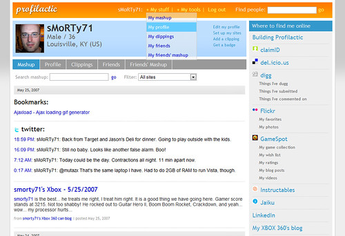
Sneak peek at the new Profilactic UI
Part of the big June release is a new UI. I started working on the new design this week and started committing it to HTML and CSS last night.

View a larger screenshot here.
So far, I really like where it is headed and thought I would share it to get feedback. So what do you think?

View a larger screenshot here.
So far, I really like where it is headed and thought I would share it to get feedback. So what do you think?
